The Mission
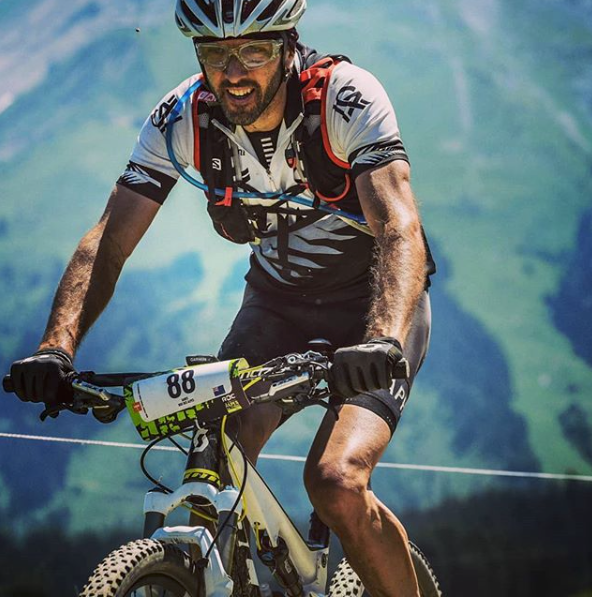
Jay Dignan (the Client) runs a consulting company called Outdoor Body Nutrition looking to change how we view food and exercise. He approached me looking for an identity in the form of a simple wordmark to set him apart from an oversaturated market. An identity encapsulating his origins, personal growth, strength and the outdoors.
The Outcome
The identity was designed from the roots up as there wasn’t any brand established at that point in time. This was done with the companies’ core values in mind: personal growth, strength and the outdoors, including Jay’s roots, New Zealand.
The Impact
The new identity is currently being implemented across the companies’ social platforms. Reception has been positive.
Services Provided:
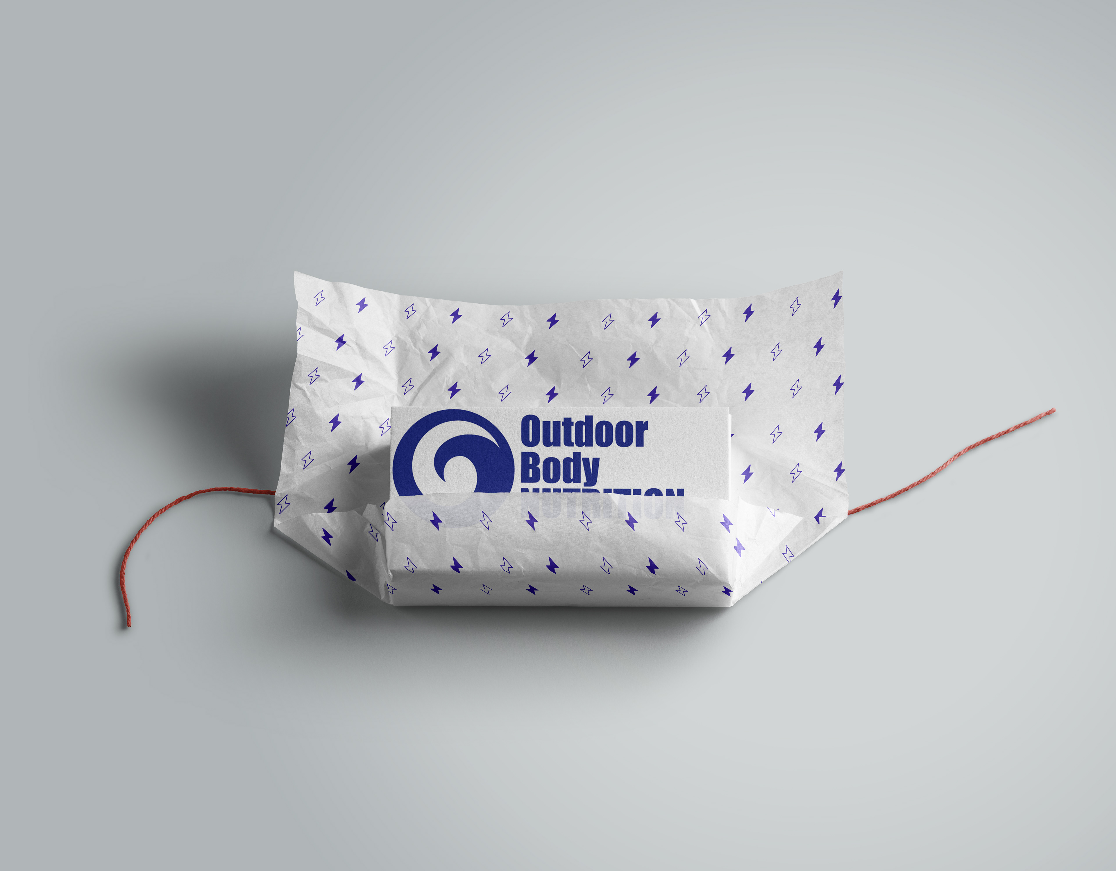
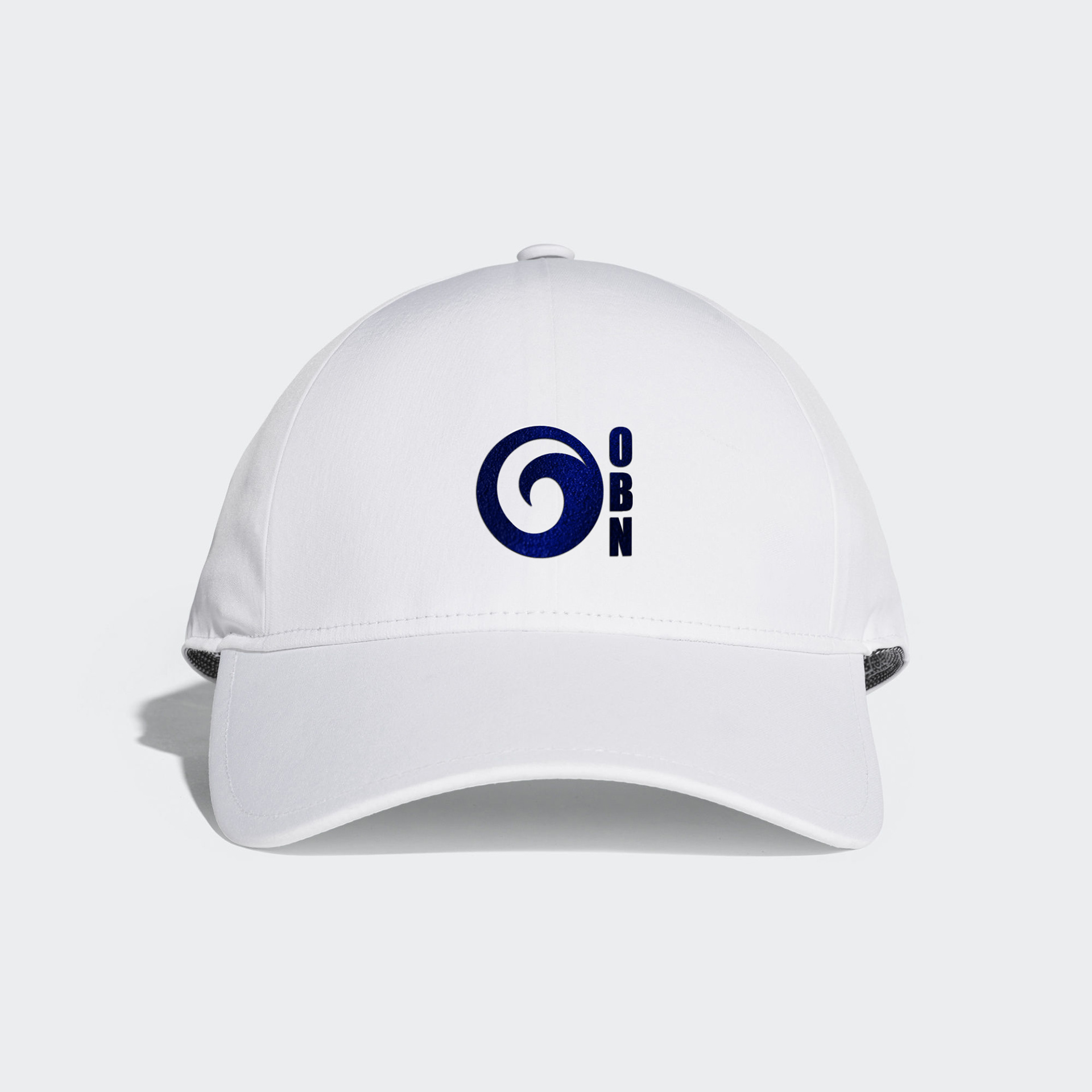
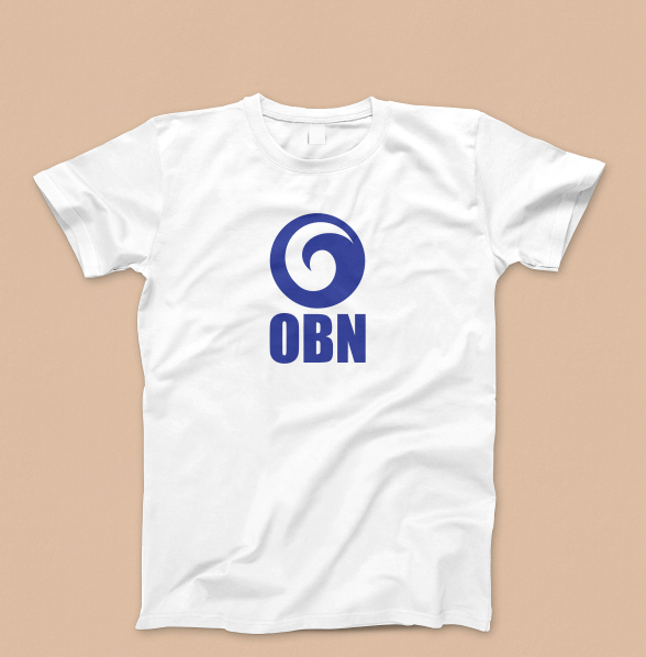
Brand Identity / Logo

The Process
Jay has spent the last few years experimenting and studying first hand the various evidence based nutritional diets have on his body. He understands that here is no glove that fits all, which is apparent in his philosophy and vision to teach people how to eat and exercise. In fact it could be said Jay is a walking talking case study of his beliefs.
With his various platforms in place it was clearly apparent to Jay that there was no visual identity, nothing differentiating his brand from the competition.
Initially the Brief called for a simple mono-toned word mark. After the initial exploration Jay was looking to include his Kiwi (New Zealand) roots into the original request.
This is where the exploration and collaboration began. Finding a clear solution covering the company’s values as well as Jay’s roots.
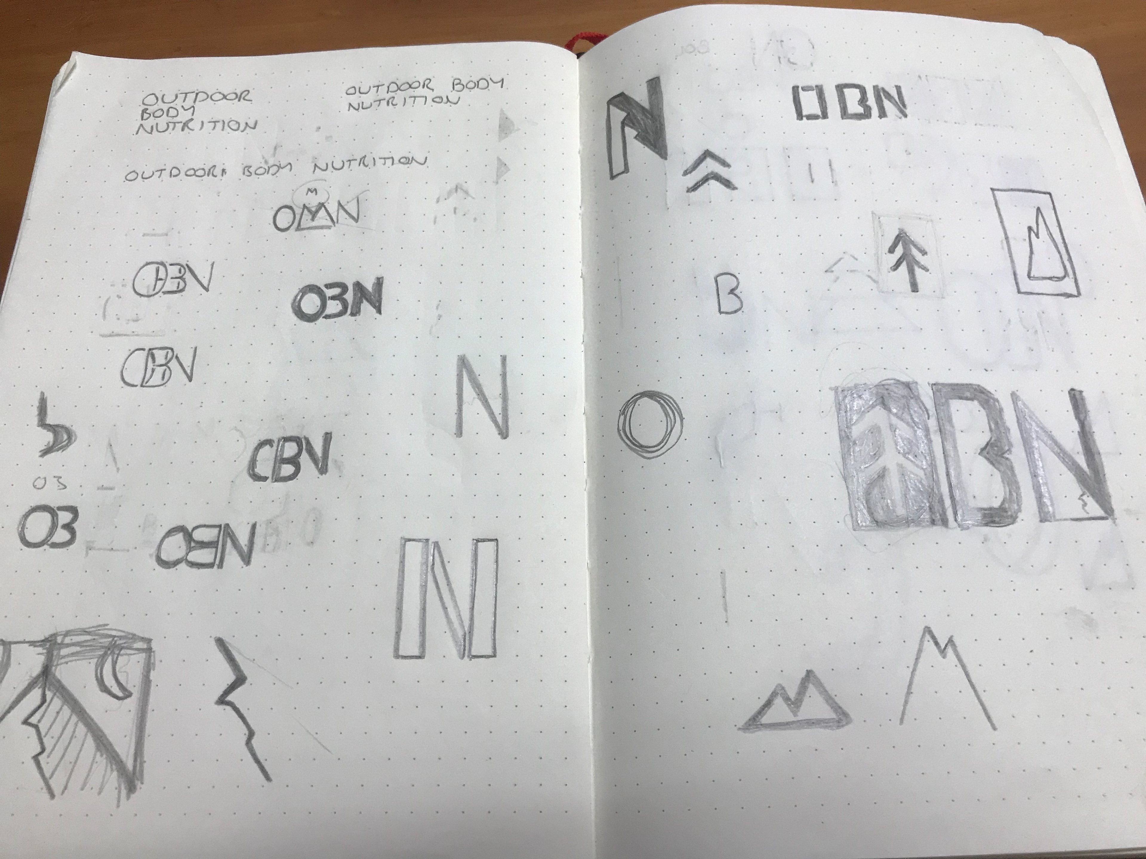
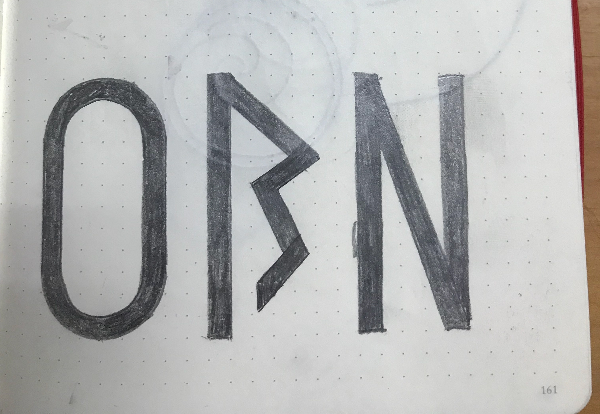
After much research, brainstorming and communicating ideas with each other the ideas started forming into a viable solution.


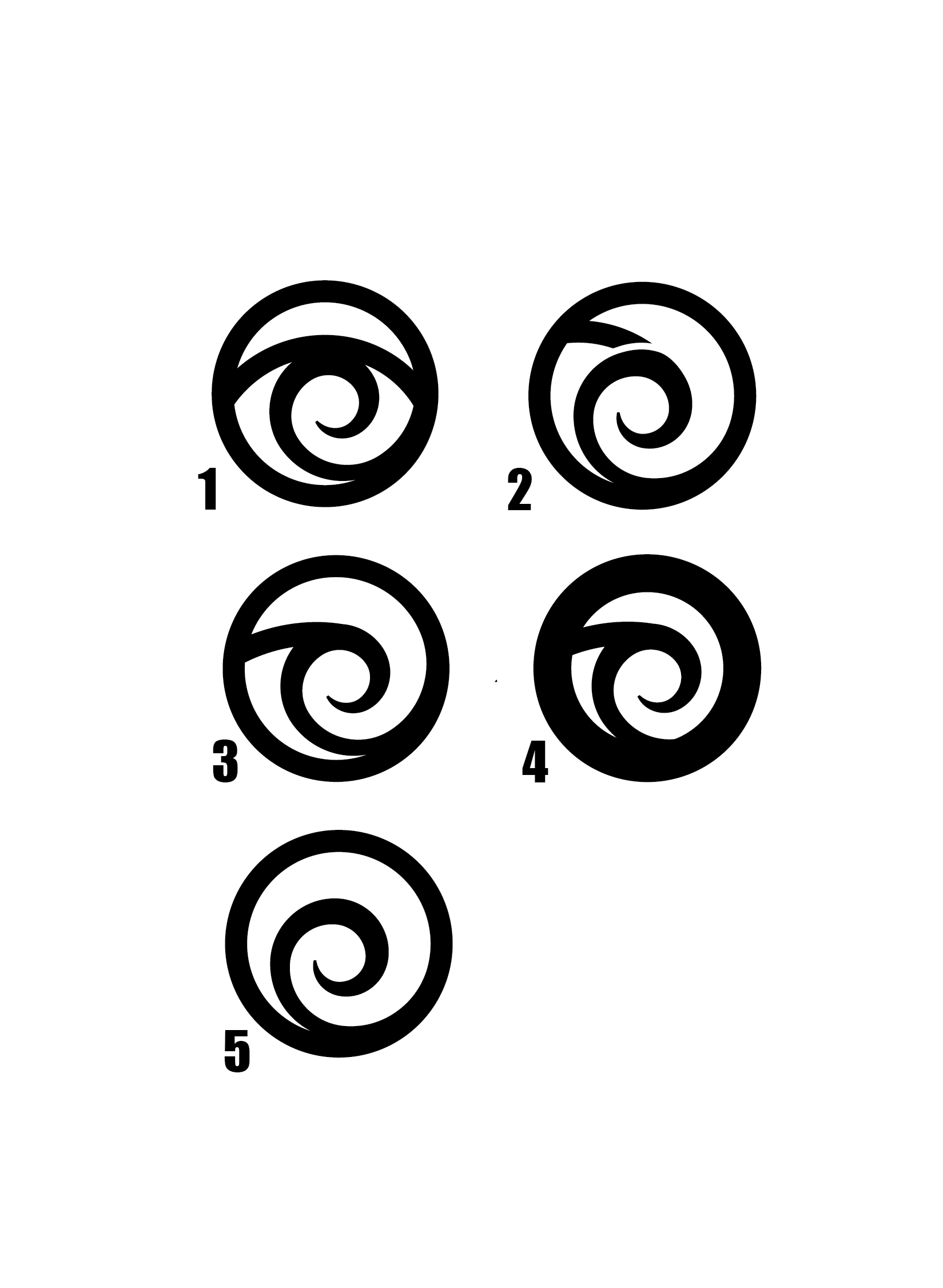
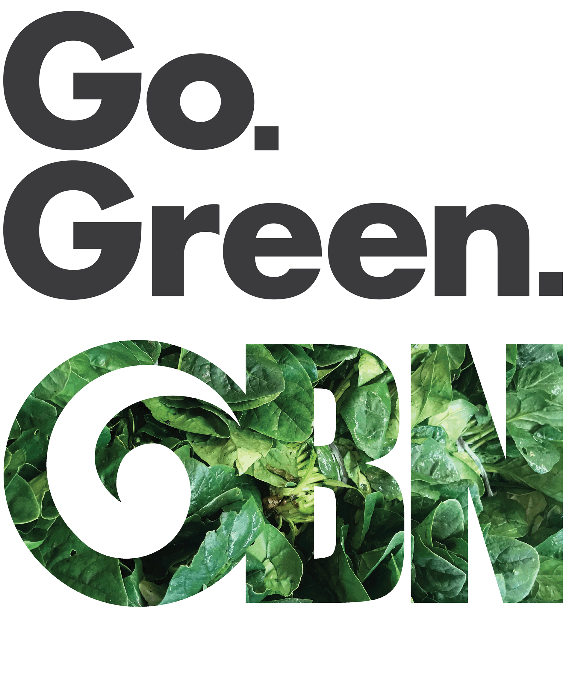
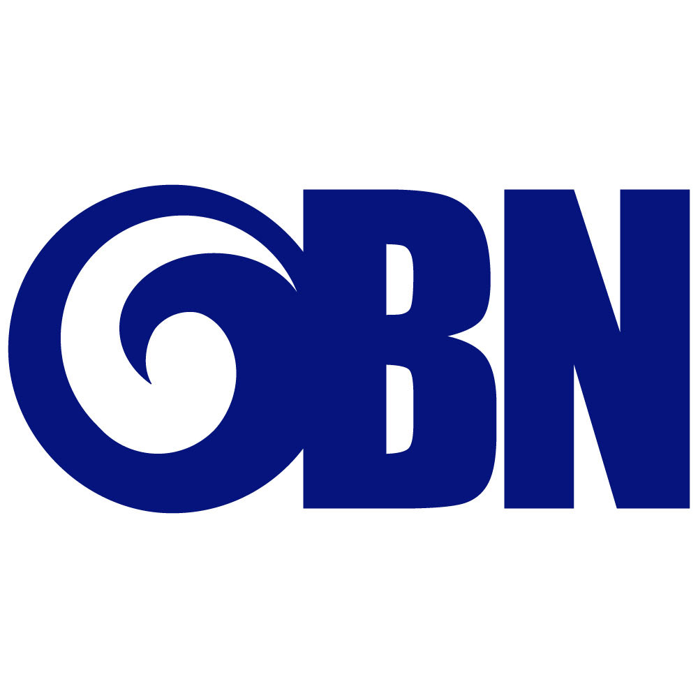
The Final Concept
The Koru and a Wave. Simple and symbolic.

The mark encapsulates the idea behind Outdoor Body Nutrition: starting from Jay’s origins to personal growth, strength and the outdoors.