The Mission
The Client had just started up a new Commodity Trading company and was looking for a Logo. The Brief was extremely loose and I was left up to my own devices. On the surface this may seem ideal but having such an open ended project can have its challenges.
The Outcome
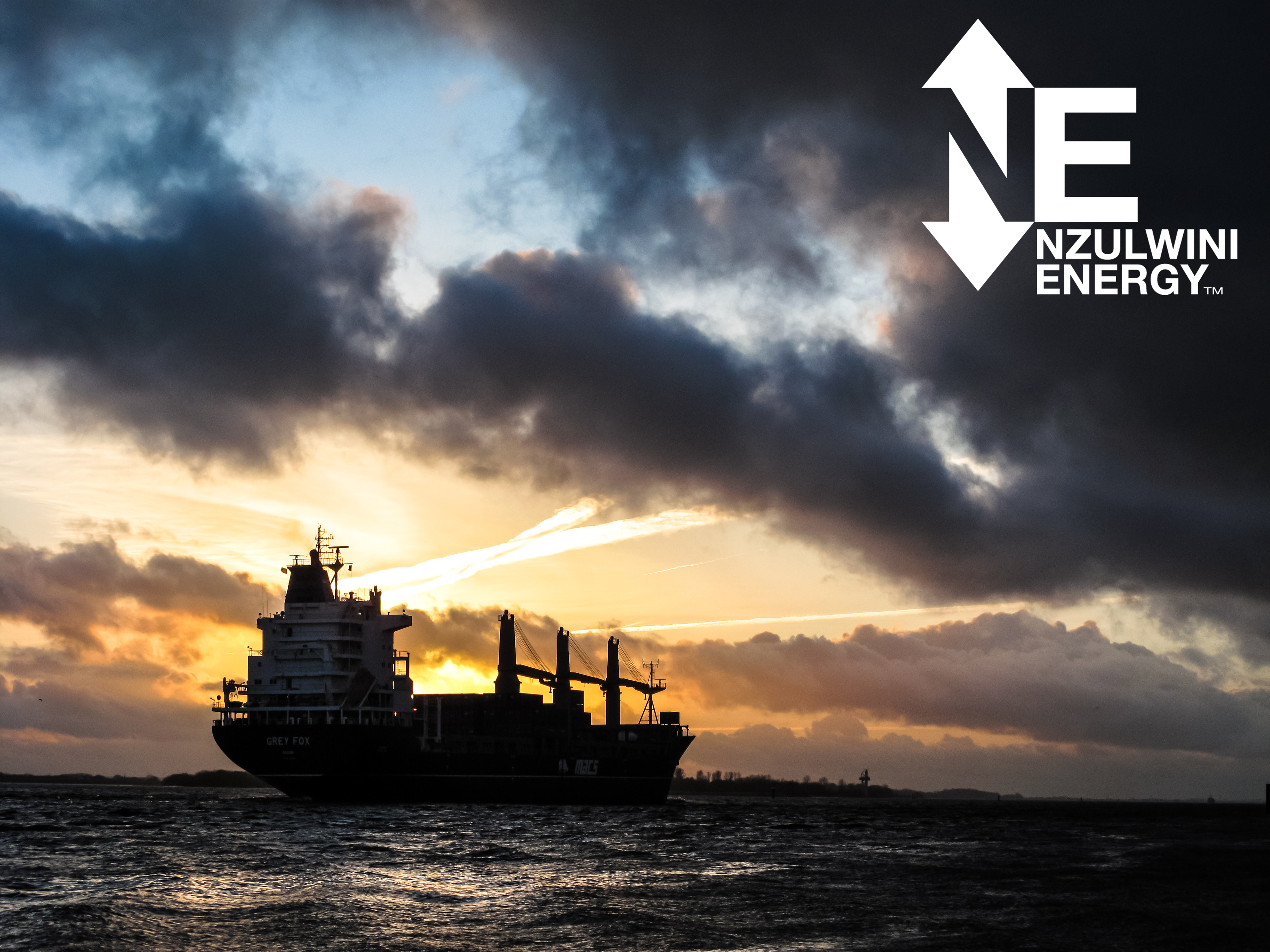
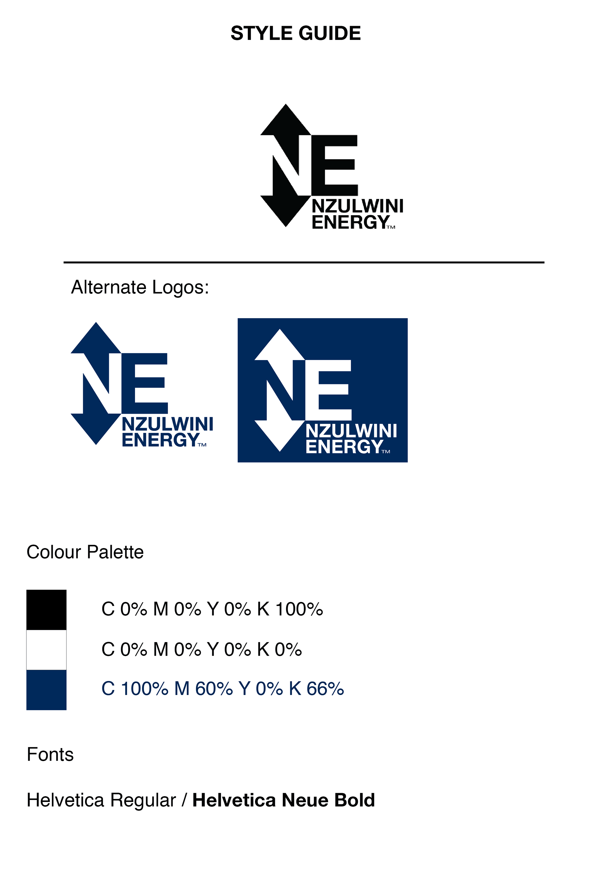
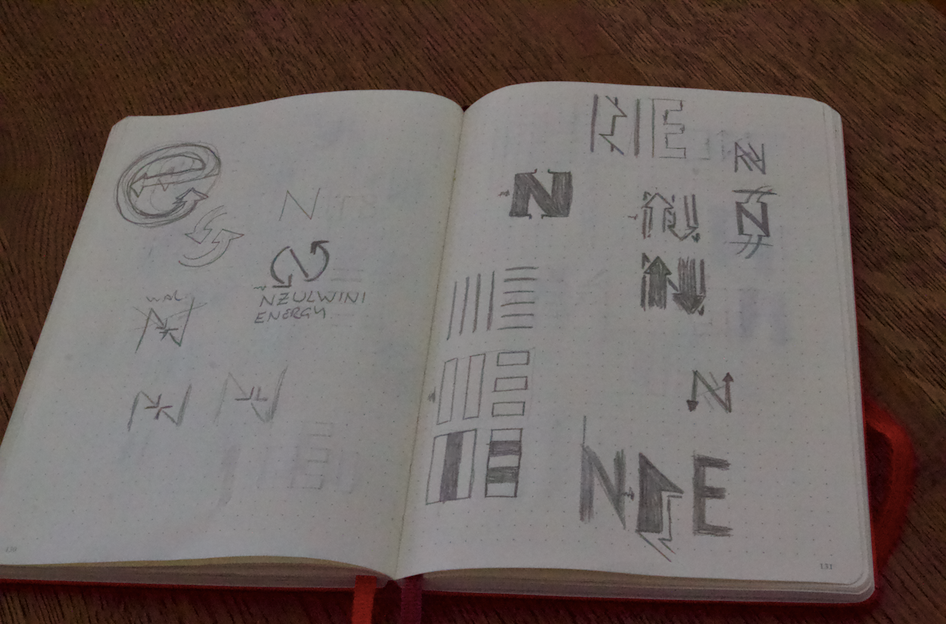
Having previously worked in the commodities industry I am well aware of an over use of either the oil drop or gear icons. Moving away from the obvious I took particular interest in the constant market movement, or price change. Using the N as negative space, I applied an upward and a downward arrow representing the perpetual shift in the commodity market.
Services Provided:
Logo / Wordmark
The Process
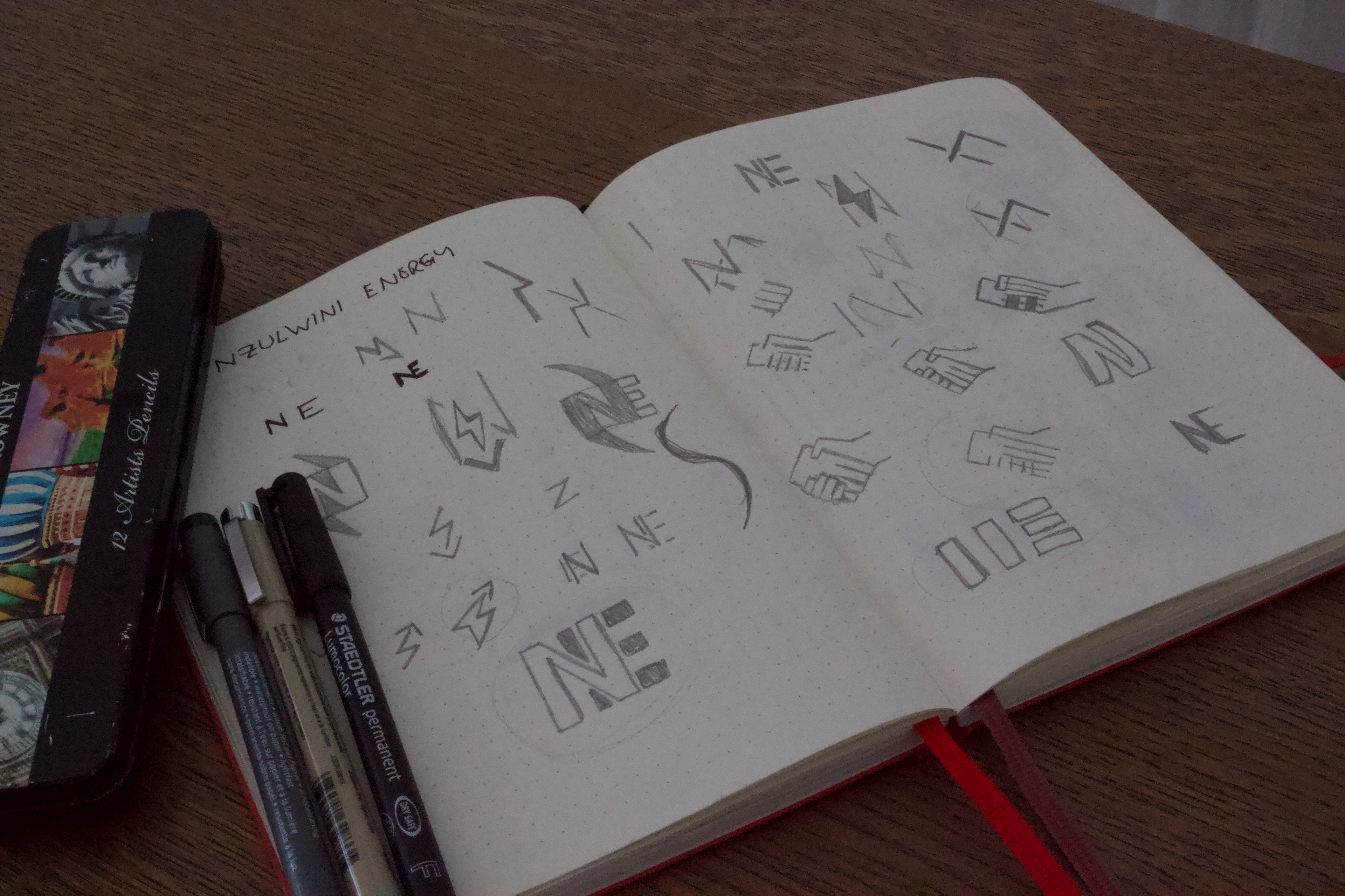
With so much lee way given with regards to the design element and what was required it was quite a challenging exploration process. Having a background in the industry did make the task at hand a little easier.

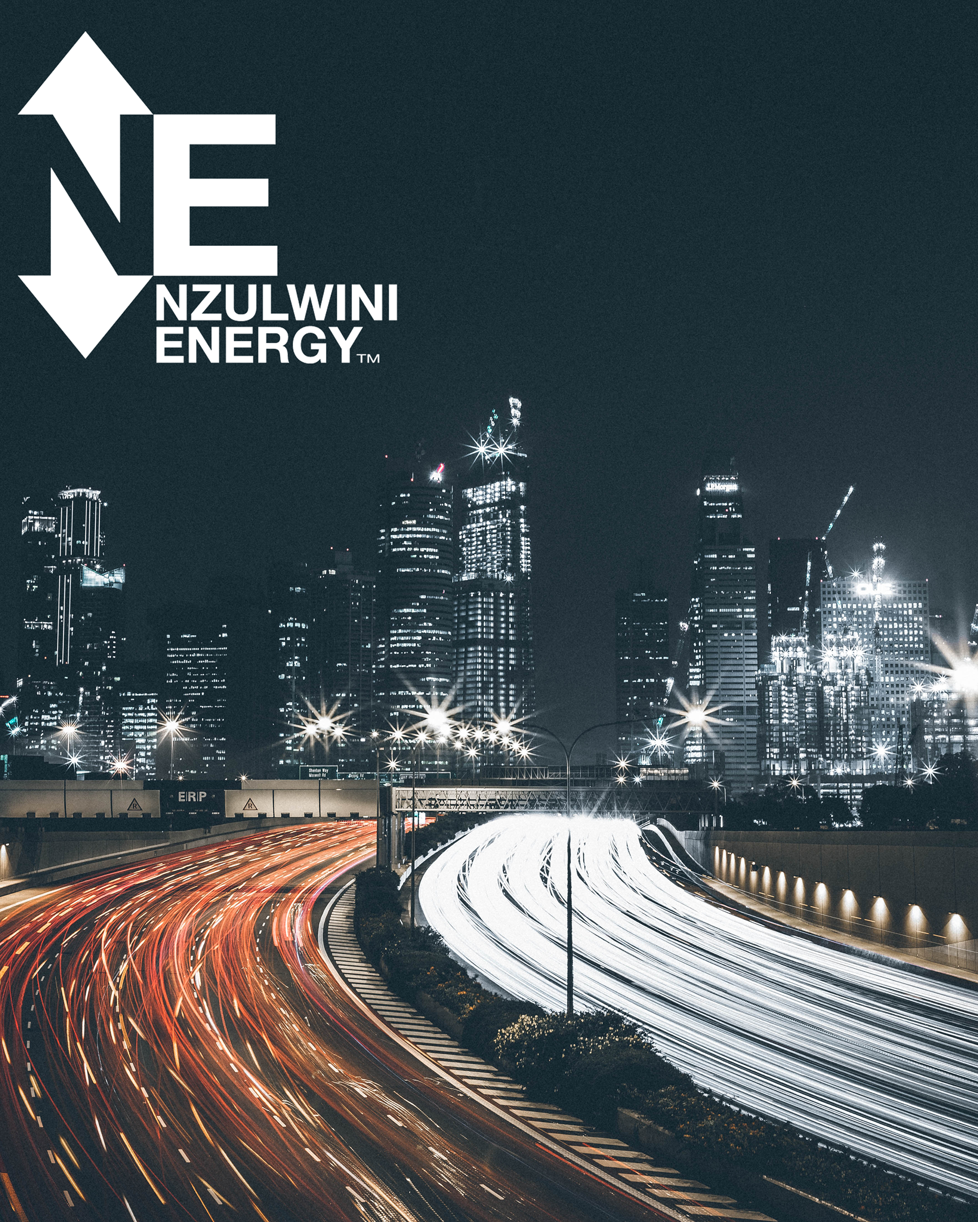
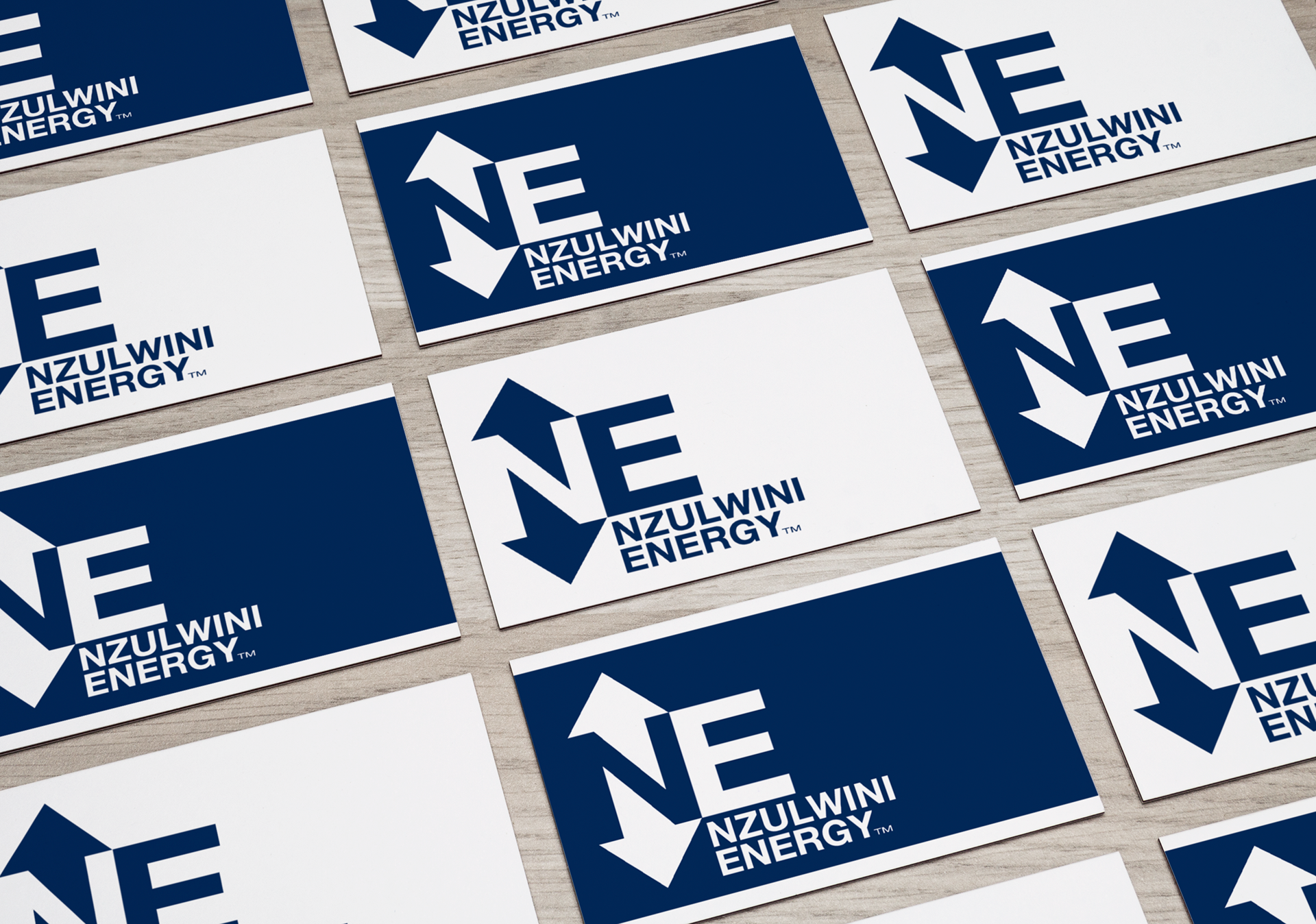
The Final Concept